Social Garden · 2017–2020
Lead Generation Redesign
Rebuilding a high-volume campaign machine from the ground up — turning underperforming landing pages into conversion-optimised growth engines — lifting average conversion rates from 1.5% to above 5% across two of Australia's most competitive digital verticals.
Clients Include
Role
Lead Designer & CRO Strategist
Timeline
2017–2020
Tools
Figma · Sketch · Adobe Creative Suite · Zeplin · Marvel · Asana
Overview
The Campaign Machine
At Social Garden, I operated at scale. Over three years, I led the design of hundreds of lead generation campaigns across property and education — two verticals where the margin between a high-converting campaign and a failed one can represent millions of dollars in pipeline value.
The brief was clear: make the numbers move. But what that actually required was a fundamental reimagining of how campaigns were conceived, designed, and delivered — from a reactive, output-focused production line into a strategic, data-informed, human-centred design operation.
Everything from the visual design approach to the internal collaboration process was rebuilt from the ground up. The result: conversion rates lifted from an industry-average 1.5% to consistently above 5% — and a design team that understood not just how to create beautiful work, but why it performed.
Before & After
Before
1.5%
Average Conversion Rate
233% lift
After
5%+
Before
Low
Design-to-Strategy Alignment
Full process redesign
After
High
Before
~100
Campaigns Produced
>50% output increase
After
200+
Before
0
Team Members Trained
Cross-tool proficiency
After
8
The Challenge
Design Without a Strategy Is Just Decoration
When I joined, campaigns were being shipped at volume but not at quality. The output was prolific; the performance was not.
Flat, Disjointed Campaign Output
Campaigns were being produced reactively, with no unified visual language or structural framework. Each landing page felt like a one-off — inconsistent in hierarchy, typography, and tone — making it impossible to identify what was working and why.
Conversion Rates Stuck Below 2%
Average conversion rates across both the property and education verticals were languishing between 1.5–2%. Without a data-informed design process or genuine CRO thinking embedded in the workflow, performance improvements were largely left to chance.
No Collaborative Process
The production pipeline was siloed. Designers, copywriters, and strategists operated independently, leading to misaligned briefs, last-minute revisions, and a final product that rarely reflected the full strategic intent of the campaign.
Generic Visual Design
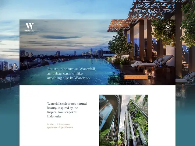
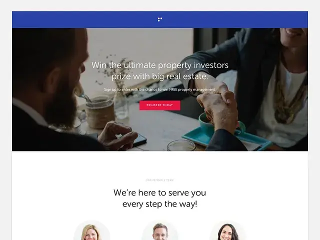
With premium property clients like Mirvac and Woodlea, generic landing page aesthetics simply didn't cut it. Low-quality imagery, inconsistent typography, and no emotional resonance in the visual design was actively undermining brand trust — and click-throughs proved it.
The core problem wasn't a lack of design skill — it was a lack of design thinking. The team was executing briefs, not solving conversion problems.
The Method
CRO-First Visual Design
Conversion Rate Optimisation isn't a post-launch task — it's baked into every design decision from the first wireframe. Here's how we made visual design do the heavy lifting.
Above-the-Fold Obsession
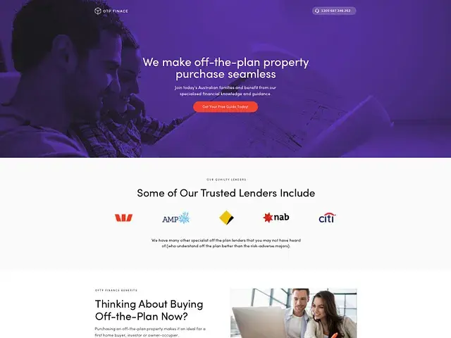
Every landing page we produced started with a single question: what does the user see in the first three seconds, and does it make them want to stay? Hero sections were designed with a laser focus — one clear value proposition, a single dominant CTA, and visual hierarchy that pulled the eye exactly where we needed it to go.
Psychological Triggers by Design
We systematically embedded proven persuasion triggers into the visual design itself. Social proof (testimonials, logos, award badges) was placed directly adjacent to CTAs. Scarcity indicators were introduced for property campaigns with limited release stages. Trust signals — certifications, guarantees, media mentions — were elevated above the fold.
Visual Hierarchy as a Conversion Tool
Typography, colour contrast, and whitespace stopped being aesthetic decisions and became strategic ones. Headlines were tested at multiple sizes and weights. CTA buttons were A/B tested for colour, copy, and positioning. The goal was always a frictionless path from first impression to form submission.
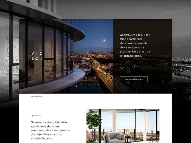
Photography & Mood Over Stock
For premium property clients, we moved aggressively away from stock imagery. High-quality lifestyle photography, architectural renders, and on-site production assets became non-negotiable. The emotional impact of the right image — aspirational, human, contextually relevant — consistently outperformed generic alternatives in split testing.
Mobile-First, Always
With the majority of campaign traffic arriving via social ads on mobile, every layout was designed mobile-first without exception. Thumb-friendly CTAs, vertically optimised hero sections, and minimal-friction form fields were standard. Desktop was a refinement of mobile, never the reverse.
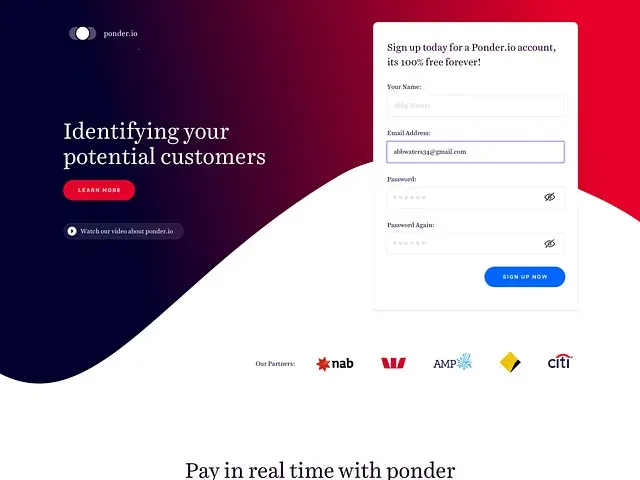
Form UX & Friction Removal
Forms were the final conversion barrier, and we treated them accordingly. Field counts were ruthlessly reduced to the minimum viable set. Multi-step forms were introduced for higher-intent prospects. Auto-fill compatibility, inline validation, and progress indicators were standard across all education campaign forms.
Our Rules
The Four Design Principles We Never Broke
Across hundreds of campaigns and dozens of clients, these four principles proved their worth time and again. They became the backbone of every brief review and design critique.
One CTA Per Page
Every competing action dilutes attention. Our rule: one primary conversion goal, one primary CTA. Secondary links were removed or deprioritised below the fold.
Benefit-Led Headlines
We moved away from feature-led copy ('3 Bedroom, 2 Bath') toward benefit-led emotional hooks ('Wake up to bushland views, every morning'). Testing consistently validated the latter.
Contrast as a Weapon
CTA buttons were always designed with maximum contrast against the background — never blending into the colour palette. Accessibility compliance was a fortunate side-effect of good CRO practice.
Directional Cues
Photography was selected and cropped so that subjects' eyelines pointed toward forms and CTAs. Visual arrows and directional shapes reinforced the natural reading flow toward the conversion point.
Process
The End-to-End Campaign Process Redesign
Before the process redesign, campaigns moved from brief to launch with minimal structured checkpoints. After: a six-stage collaborative process that aligned design, strategy, and client expectations at every step.
Strategic Brief
Campaign goals, audience segmentation, and messaging hierarchy defined in collaboration with the account and strategy teams before a single pixel was touched.
Concept & Wireframe
Low-fidelity wireframes established the structural layout, information hierarchy, and CTA placement. Shared for stakeholder feedback before any visual design commenced.
Visual Design
High-fidelity designs produced in Sketch/Figma, referencing the client brand whilst layering our CRO design methodology — informed by data from previous campaign performance.
Review & Iterate
Structured review cycles with account managers, strategists, and where accessible, clients. Feedback was managed through Zeplin and Asana, with clear version control.
Build & Launch
Handed off to development with annotated specs via Zeplin. QA sign-off checked against the design on desktop and mobile before campaign traffic was switched on.
Measure & Optimise
Post-launch, conversion data informed iterative improvements — headline changes, CTA copy tweaks, image swaps. Each campaign fed learnings back into the next.
Leadership
Building a Design Team That Understood CRO
Growing the team's capability wasn't just about showing them how to use the tools — it was about shifting the way they thought about design. A beautiful landing page that doesn't convert is a failed campaign, regardless of how it looks in the portfolio.
Tool Proficiency
Trained the team on the full design-to-development stack — Adobe Creative Suite, Sketch, Zeplin for handoff, Marvel for rapid prototyping, and Asana for campaign project management.
Strategic Thinking
Implemented regular design critique sessions focused not on aesthetics alone, but on conversion rationale — why does this button placement work? Why does this image choice support the headline?
Cross-Functional Collaboration
Led the introduction of a human-centred design thinking approach across the business — not just within the design team, but influencing how account managers briefed campaigns and how strategists framed success metrics.
Process & Wellbeing
In a high-volume, deadline-driven environment, sustainable output required sustainable people. Training covered productivity habits, creative health, feedback frameworks, and managing high-pressure campaign cycles.
Campaign Gallery
Result
Numbers That Spoke for Themselves
Three years, 200+ campaigns, and a complete transformation in how a digital agency approached visual design and conversion. The results weren't a lucky streak — they were the compound output of a disciplined, repeatable design process with CRO baked in from day one.
- Average conversion rate lifted from 1.5% to above 5% across both property and education verticals — a 233% improvement.
- 200+ campaigns designed and optimised, increasing the team's previous output by more than 50%.
- End-to-end process redesign improved collaboration, quality, and client satisfaction across every campaign type.
- A design team of 8 trained in CRO thinking, not just visual execution — a lasting capability shift that outlived any individual campaign.
💡 The biggest insight from this chapter: when design and strategy are genuinely aligned — not just in the brief, but in the daily workflow and the team's mental model — conversion isn't an outcome. It's a by-product.
Last updated · June 2026